Communication Brand
CommunicationView brand message
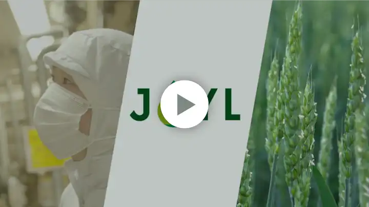
JOYL is based on oil
Make an overflowing future come true.
This feeling is expressed by combining JOY and OIL to create the JOYL.
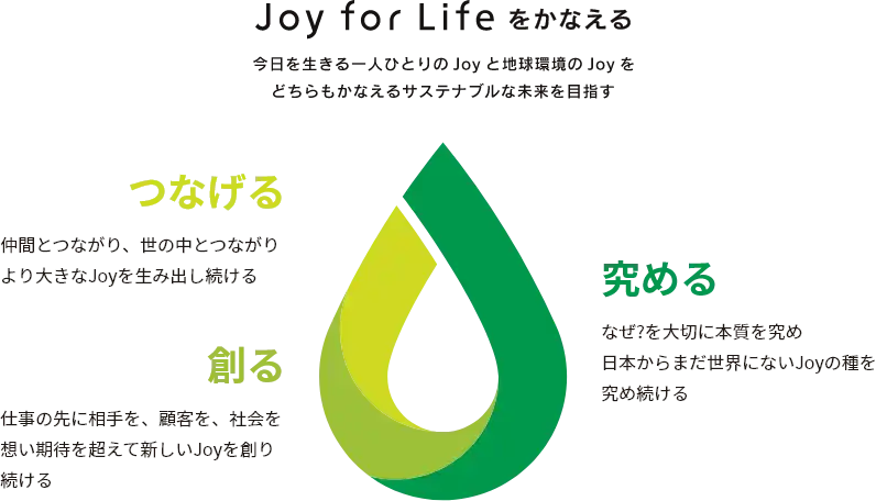
What the logo represents

We are Jay Oil.
Using oil as our starting point, we aim to bring out the potential of nature and bring joy to both the people living today and the global environment. We have incorporated this desire into the name "JOYL."
The theme color is green, which represents our belief in plants that produce oil, starch, and protein, and our determination to contribute to a sustainable future.
The three colors of the oil drop mark represent our determination to "master" the knowledge and technology to draw out the potential of nature's blessings, to "create" joy that exceeds the expectations of the people at the other end of our work, and to "connect" with our colleagues and the world at large and nurture the joy that we create.
The thoughts behind "Green Oil Drops"
"Three driving forces behind Joy for Life®"
The O in the JOYL logo is designed to look like a drop of oil. This represents our desire to spread joy beyond boundaries, starting from oil, and to realize Joy for Life®. Each of the three greens in the drop of oil also has a different meaning.
Our new “communications brand”, JOYL, is a way to express our philosophy of joy.
As a supplier of edible oils by reaping nature's potential to support diets,
we aim to bring joy to the people through our attention to minimizing environmental impact.
Our theme color is green, drawing attention to the plants that produce oils, starches, and proteins.
The color also expresses our determination to contribute to a sustainable future.
Three colors of the oil drop represent our determination to maximize the joy we create and include the following meanings;
1) to quest for the knowledge and technology to harness nature's bounty,
2) to create joy by exceeding stakeholders' expectations,
3) to interact with people and society.